Today, I draw the line at learning Blackberry development.
This blog is about being a designer and a developer. And as the only person in my Marketing department, I do the jobs of at least three distinct positions, if not more. I'm not saying I do the work of three people, they keep me busy, but not that busy! However I am the sole person responsible for internal applications development (barring IT/systems admin support for server and database management, and most reporting), marketing strategies and tactics, and graphic design/creative direction. In these varied roles I find myself making distinct "hat switches" from day to day: Monday I design and mail a few thousand postcards, Tuesday I upgrade our dashboard application, Wednesday I coordinate trade shows. And so it varies.
It's just too much of a shift to spend the first part of my day planning a direct mail campaign, and the second half programming Flex and CF. Sure, I've done it. But I find I am more productive if I put on one hat and wear it all day, than if I jump around between tasks. I'm not sure if I get more done that way, but it feels like I do! I design better if I'm not thinking "but how will I program this?." I program better if I stay knee deep in code once I'm there. I open my mind to develop marketing strategies better if my mind isn't cluttered with thoughts of design patterns and syntax.
This generally works, but I feel I could be a lot better at any one of the three, if I just focused on it all the time. Extra hours of experience aside, never having to think about the other roles would help me focus and specialize. I've struggled with this a lot lately, thinking that I need to specialize my skill set (way before Seth made this post). And I've wondered...where do I draw the line in learning new skills? Should I?
My company recently moved from hosted Blackberry service to our own BES, and the opportunity of deploying our own applications and themes has excited management. Since I do all of our internal applications development, I will theoretically be writing any Blackberry applications we develop. I read up on basic Blackberry development a few months ago when this prospect first arose, and got to understand the basics, but somehow I cannot get behind forcing myself to take on Blackberry development, nor do I see a lot of need for us to develop BB applications.
I will always learn what technology is required to do my job, and I certainly never plan to just "stop" learning new skills because my brain is full, or such nonsense. However, I do feel like venturing into BB is unnecessarily broadening my already ridiculously general skill set. As the Director of Marketing, do I "pull title" and tell the IT guys they're on their own? I'm thinking now would be a good time to do that.
Technical learning curve aside, I might feel different about this if I saw a real need for a custom BB application within our organization. But none of our core systems (the ones that would really be valuable if they were mobile-accessible) have any type of open API that would allow proper integration (read: I would have to directly connect to an undocumented legacy database, and probably violate our software license), so anything I build would be a total band-aid solution, mobile "just because we can". Hardly worth learning a new skill for that.
Despite my goal of being a lifelong learner, I feel like at some point I have to say: "let someone else deal with it!" So ends the rant of this designer-developer, and I'll put this out there to all the other generalists: where do you draw the line? How do you decide NOT to learn something? How do you juggle different roles?
Showing posts with label design. Show all posts
Showing posts with label design. Show all posts
Wednesday, May 14, 2008
Monday, March 24, 2008
Speaking on AJAX Usability at CFUnited
I've attended CFUnited since it was called "CFUN" and held in a single room (how it has grown!), and I'm excited to say that I will also be a speaker this year. I will be speaking on AJAX Usability. My talk, as of this writing, will be on Tuesday June 19th at 9:30 am.
A little bit about my talk...
When AJAX first became widespread, several usability gurus aired concerns about how this new power could be abused, and we've seen no shortage of AJAX usability mistakes on the web. Thankfully, many design patterns and best practices have also emerged, and following these guidelines can help you avoid those pitfalls. In my session, I will cover some of the top usability issues you should be aware of when using AJAX, and show practical examples of how to overcome them.
Because there are so many AJAX libraries and toolkits the code can vary greatly, my session will focus more on the usability principles and design of the interaction, rather than code snippets. Where possible I will recommend specific libraries or resources that help address these issues. If there is time (still working on the presentation!), I will also touch on how you tweak your design workflow to better incorporate rich interaction.
This session will target the intermediate UI designer. I will assume you have designed websites in the past and have studied basic usability, but you do not need to be a guru. If you are a developer with limited design experience who uses AJAX, this session is for you. If you are a designer who is now expected to design applications that incorporate AJAX, and you want to be sure your usability knowledge is up to date, this session is for you. If you think your AJAX applications are "as usable as they need to be", this session is for you! (Because there is no such thing as too usable!)
Wednesday, March 5, 2008
On Creativity - Andy Rutledge Read My Mind
I wish I could have written this! This article on ALA says--far better than I ever could--so many things that have been on my mind as I come to terms with my own sense of creativity.
http://www.alistapart.com/articles/oncreativity/
http://www.alistapart.com/articles/oncreativity/
Thursday, February 28, 2008
Effective and Usable Validation for Long Term Data Entry and Workflow
This topic sure sounds droll! But I've been thinking about it a lot as we've dealt with these issues at my company, so I thought I'd do a brain dump.
In large applications that store complex data, validation of form input is likely going to be more involved than just checking the fields' existence and format on submit. Many times the data comes in in bits and pieces, over a long period of time, and is entered by several different users, before the form is "complete". The validation rules may also have too many exceptions and special cases to really enforce them. This probably comes back to poor process and application design, but it certainly exists and you may just have to live with it. However, some type of validation needs to be in place to maintain data integrity - whether its for reporting, data mining, or simple assurance that the information in the database is accurate.
One approach for validating this "long term" data entry is to attack it in stages or tiers, with each progressive stage becoming more stringent, until the final step at which everything must be complete before (figuratively) closing the file. Here's an example.
Stage 1 - Alerting the user to data that is needed.
Non obtrusive alerts serve to bring the user's attention to parts of the form that they "may want to fill out" before moving to the next screen. This warning should be clear in its purpose, to essentially let them know, "at this stage in the process, you usually want these fields to be complete". This might be some type of border, icon or label combination that indicates important fields. The warnings will only apply to this particular step of the workflow. There may also be different levels of warnings - such as "information alert", then "warning", then "critical error" - with different rules as to whether or not the workflow can continue with their presence. If future steps in the workflow are dependent on the existence of certain data, that would usually mean that it's a "critical error".
Step 2 - Warning the user that data is needed.
Now the user is attempting to move forward in the workflow, and data is still missing. When the user hits the button to send the form on to the next stage in the Workflow, they will see a validation warning - a pop up window or screen - that says "these fields should be filled out before moving to the next stage". The missing fields should also be highlighted in such a way that the user can easily see what's missing, perhaps with an error message next to them. At this point, you may want to prevent them from moving forward until the data is complete, or allow them after they acknowledge the warning. This depends on the situation and the stage in the process. The warnings usually only apply to the current section in the workflow, and may also follow a scale of severity.
Step 3 - Preflight before closure
When the file is approaching closure, as the final step, there is a preflight stage, where a list of exceptions or warnings is presented to the user before closing the file. Up until now, the only warnings shown apply to the current step in workflow. Now the preflight "issues list" will show exceptions from every stage, organized by stage, and ideally give the user a single, simple place to fix these issues (such as a custom wizard/form that walks them through completing each field step by step) before proceeding. As with the other errors, the preflight will show exceptions on a severity scale, from "information" to "warning" to "critical error". You can decide how to handle each level of warning, but typically warnings "should" be fixed, and "critical errors" will prevent the file from closing.
Step 4 - Post close audit
Depending on your business rules, files may have closed with information still missing. Therefore, you will want to have an audit report (really, it should be available at any step in the process) that will show each exception allowing errors or missing data to be easily found and corrected. You may also wish to display this information with the individual users at each step in the workflow, so that you can tell who sent this file to the next stage with incomplete data.
A good working example of this type of validation is consumer tax preparation software such as TurboTax. Building flexibility into the data entry process, and allowing the user to move forward even with incomplete data can dramatically improve usability - required fields are the user's enemy - but there need to be checks and balances to ensure data integrity is maintained.
Friday, February 22, 2008
Business Card Printing Round-Up
Business cards. Everyone needs em. And now with online printers and digital printing's coming of age, everyone offers them. So where's the best place to get them? Often with printing, the selection is driven by budget. Many businesses will order cards from whoever offers the cheapest price.
However, there are often substantial differences between all the millions of printers out there, and some businesses are discriminating about quality, especially when it comes to their stationery. They may demand special print methods, colors, and paper. Large businesses want someone who can produce their business cards reliably, cost effectively and consistently - in large volumes, with frequent orders, and a simple ordering process (online) that doesn't burden the HR department who typically handles business card orders. Then there are plenty of small time side workers, independent contractors, or individuals who need business cards, not very many, not very often, not very expensive, but want something better than micro-perf cards they can print at home on their inkjet.
Ultimately, the printer you select for business cards really depends on your business's situation. I always have directed clients and companies I've worked with to various printers depending on the job. In my current situation, the driver was, as usual, price. Not that my current printer was charging too much. Ok they were. They are good, I use them for a lot of things, but the prices I was getting on business cards was at least double what I was seeing online, and seeing how much of my marketing budget gets eaten by stationery, I was determined to get a lower rate. I had previous discussions with my printer brainstorming how we could produce our business cards more cost effectively. I know that printing is a very competitive business, and I appreciate good work, so I did not want to push them to simply lower their rates.
I asked about their options for shells - that's where you pre print high quantities of templates with logos and other standard marks, and then you just imprint the individual person's contact info on top of it - often with a single color - in smaller batches, reducing the total cost per set. I asked about batch orders - printing several cards at once. I contemplated changing specs (we'd already gone from three to two color), and determined that the best option would be to submit orders in batches.
So I carefully managed my batch orders (time consuming!), sending as many at a time as possible, often with the effect of forcing people to wait longer for their cards than I would want them to - and forcing me to print temporary cards on our laser printer until the orders could be placed. Having worked with batch runs on this job and shells in previous jobs, I have experienced all of their drawbacks, and in today's world, on demand is really a superior option. So my requirements in locating a better business card printer - if there was one to be had - were these.
1) Local Business Printing Franchise who I will not name specifically - I don't want to hurt their reputation, and my experience with them has been no better or worse than a variety of similar printers I've worked with - the pros and cons are the same.
2) 48HourPrint.com - up and coming online printer, their name says it all - fast, quality printing is their promise.
3) PrintingForLess.com - one of the "original' budget online printers, popular and successful - low cost, quality printing is their deal.
4) VistaPrint.com - another popular online budget printer, who focuses a lot on the consumer market, and boasts some of the lowest prices anywhere
Two other printers that I had on the list for consideration if none of the above worked out were
a) ModernPostcard.com - an online printer specializing in direct mail (that's what I've used them for and they were good), who also offers a few other standard print products
b) PSPrint.com - an online printer specializing in standard products at low prices. I've used them for greeting cards and they came out great.
I did not start with these because the options they offered were more limited, and would not allow me to exactly duplicate the specs I was currently working with.
Lastly - there's always the "high end" lithography/engraving/specialty etc printer who will tell you they're happy to do business cards, and the results will be stunning (if it matters) - but you will pay a boat load and they will push you to print large runs and batches to make it more cost effective. They're only an option if money is no object, and ideal if distinctive quality is essential. Better to let them handle your annual report.
Specs
My specs were for a quantity of 500, single sided, two or four color (whatever options available), no bleeds (that's where the color goes off the edge of the paper), uncoated matte white cover stock, 100# + in weight or 12-14pt in thickness.
Here are the results:
#1 - Local Business Printer
Pros:
Cost:
158.50 printing
17.06 shipping and fees (averaged from several orders)
The local printer runs every business card as a custom print job - just as if it were a brochure or a flyer or stationery. I got to pick the inks and papers - we were printing with spot color, which is often a necessity on business cards to get crisp text and intense color, as well as perfect corporate color matching. The paper was a popular stationery stock, in a nice bright white, a heavy 110# cover weight, and smooth finish. I also have a relationship with this printer, so they are never more than a call away, and they "know" me - the paper we use, they have our logo and fonts on file, and we can work together well.
The problem was, their pricing was different for each run, depending on how many different names we ran. It sort of bothers me that their pricing is something of a mystery - perhaps I could figure it out if I crunched the numbers every time, but who has time for that? So I felt in the dark. Every order was charged setup and washup fees, regardless of how many were ordered. Even with my discussions with them about printing in batches, I found that the savings was not substantial in the batch sizes we were printing.
Also, to make their own lives easier, the printer was reproducing the print-ready files I was sending them (I asked them not to, and offered to change the way I was designing the files if necessary, but they seemed to do it anyway) and as we all know, every time that happens there's the chance to introduce errors. None of the errors they introduced made it to print, but it did make me lose some confidence in them, and scrutinize every proof from them in detail. The timing was also slow, both because we had to batch the order, and because they were a typical small printer with probably a single press - maybe two! They would always expedite orders if I requested it, but I think rushing every order can damage the relationship with a printer, and cost you more, so I did not want to do when it was not absolutely necessary.
#2 - 48HourPrint.com
Pros:
50.00 printing
12.86 shipping & fees
I had used 48HourPrint for flyers and had good results, so I gave them a shot for business cards. True to the name, the cards came back in 2 days + shipping time, faster than #1 whose typical turnaround was 2 weeks. The results were beautiful, with crisp printing and nice intensity - even from 4 color printing. The paper options were limited to coated only, although a dull option was available so I ordered that. Two of the three recipients raved about the dull coated paper (in comparison to the original cards - the other guy just didn't care because he'd never seen the old ones), but the CEO preferred our original uncoated vellum so that canceled them out! Also the brightness of the paper was noticeably lower than that of our original stock.
Their minimum quantity was twice what I normally order, which is fine since the cost was still low. They also sent overruns, probably 25% worth, at no charge (this is where they print extras by nature of how the art is imposed on a sheet - most printers throw these out, or add a "plus overruns" fee to their pricing and charge you extra for them) . Overruns were not really necessary since I was already ordering more than I needed, but a nice gesture. If the paper had been a little brighter white, I probably would have considered talking our CEO into liking the new paper!
#3 - PrintingForLess.com
Pros
49.95 printing
9.95 shipping and fees
PrintingForLess.com is very prominent on the web, and for good reason. Although their website looks dated and the UI has not changed in years (meaning it's rather kludgy - but works reliably), they make up for lack of slickness with service. It's unusual to see an online printer that actually tells you the name of the technicians working on your order, to get personal emails from them (and not for problems - just letting you know that they are available if you need them), as well as a follow up call to make sure we were happy with the results. And we were.
The result was the closest of any to the original I wanted to duplicate. I did order four color from them as a first try, and was pretty pleased with the color. I got a quote for using spot color, the cost was more, but still less than what I'm currently paying. I felt like the four color was close enough that I didn't need to pay extra for the spot color. The turnaround was fast, but not quite as fast as 48HourPrint. PrintingForLess does offer rush pricing and shipping in varying degrees, allowing you to conveniently pay exactly what the timing is worth to you. I hear that's actually where they make most of their money - on rush orders. But as a side, since becoming my own "director of marketing" I've all but eliminatated "rush order" from my vocabulary - planning ahead and proactivity are my preferred style!
#4 - VistaPrint.com
Pros:
Cost
42.98 printing (including paper upgrade)
14.45 shipping and fees (including upload and proof fees, which no one else charged)
VistaPrint is another prominent online printer. They target the budget market quite effectively, even offering "free" products (albeit with their name printed all over the back). Their advertised prices are so low it seems too good to be true, and it is. They upcharge you for every little detail: even an automatic PDF proof is $1.99 extra. By the time you're done adding it all up, the price is close to - maybe a bit lower than - the competition. They seem to push users to order with their predesigned templates, which are downright god-awful (ok I'm a snob), and charge you extra per file to upload your own design. Sorry, I'm a real designer here, I do it all myself. They charged extra for non-coated paper as well. Their pricing includes bleeds, but at the cost of reducing the overall cards size by about 1/16" which just bothered me. I'm sure their logic is that most would not notice and it allows them to print bleeds without using extra paper, but I do - especially when I hold it up to other business cards. And I didn't even order bleeds, yet I had to get them trimmed to the smaller size anyway.
On the upside, the card itself looked quite nice, with the brightest, heaviest paper of all of the printers (even better than the original). But the registration was ever so slightly off, giving the text that "halo" effect which, at a distance, made it look less than sharp. Not bad enough to complain about, but noticeable. Their turnaround was slow considering they are an online printer, many of whom make speed their value proposition - their "priority" turnaround was 7 days. Bottom line? I would use them for personal postcards or business cards even, for occasions or holiday printing, etc... But not for business. Also, although this order went smoothly, in the past I have contacted their customer service with quality issues and received no response whatsoever. This does not give me a lot of confidence in trusting them with all of my business cards - something that should be a simple non-issue.
In closing, PrintingForLess won out because they were superior on most points. Pricing, turnaround, quality and service were all excellent. I also liked that they gave me the option of doing custom jobs, which most online printers won't do. 48HourPrint was a close second, held back only by their limited paper options. My local printer came in third, because their price was just too high, despite their good quality. VistaPrint came in last, because I just do not feel they are a professional caliber printer - even if they are inexpensive.
However, there are often substantial differences between all the millions of printers out there, and some businesses are discriminating about quality, especially when it comes to their stationery. They may demand special print methods, colors, and paper. Large businesses want someone who can produce their business cards reliably, cost effectively and consistently - in large volumes, with frequent orders, and a simple ordering process (online) that doesn't burden the HR department who typically handles business card orders. Then there are plenty of small time side workers, independent contractors, or individuals who need business cards, not very many, not very often, not very expensive, but want something better than micro-perf cards they can print at home on their inkjet.
Ultimately, the printer you select for business cards really depends on your business's situation. I always have directed clients and companies I've worked with to various printers depending on the job. In my current situation, the driver was, as usual, price. Not that my current printer was charging too much. Ok they were. They are good, I use them for a lot of things, but the prices I was getting on business cards was at least double what I was seeing online, and seeing how much of my marketing budget gets eaten by stationery, I was determined to get a lower rate. I had previous discussions with my printer brainstorming how we could produce our business cards more cost effectively. I know that printing is a very competitive business, and I appreciate good work, so I did not want to push them to simply lower their rates.
I asked about their options for shells - that's where you pre print high quantities of templates with logos and other standard marks, and then you just imprint the individual person's contact info on top of it - often with a single color - in smaller batches, reducing the total cost per set. I asked about batch orders - printing several cards at once. I contemplated changing specs (we'd already gone from three to two color), and determined that the best option would be to submit orders in batches.
So I carefully managed my batch orders (time consuming!), sending as many at a time as possible, often with the effect of forcing people to wait longer for their cards than I would want them to - and forcing me to print temporary cards on our laser printer until the orders could be placed. Having worked with batch runs on this job and shells in previous jobs, I have experienced all of their drawbacks, and in today's world, on demand is really a superior option. So my requirements in locating a better business card printer - if there was one to be had - were these.
- Meet or exceed the quality and appearance of our current cards, so that no one would even notice (or only notice improvement in) the difference in the new cards
- Closely match the other stationery we have, from other printers
- Easier ordering process, preferably all online rather than email-and-call-and-email...
- Pricing low enough that on demand orders were realistic
- Overall savings on our business card costs
1) Local Business Printing Franchise who I will not name specifically - I don't want to hurt their reputation, and my experience with them has been no better or worse than a variety of similar printers I've worked with - the pros and cons are the same.
2) 48HourPrint.com - up and coming online printer, their name says it all - fast, quality printing is their promise.
3) PrintingForLess.com - one of the "original' budget online printers, popular and successful - low cost, quality printing is their deal.
4) VistaPrint.com - another popular online budget printer, who focuses a lot on the consumer market, and boasts some of the lowest prices anywhere
Two other printers that I had on the list for consideration if none of the above worked out were
a) ModernPostcard.com - an online printer specializing in direct mail (that's what I've used them for and they were good), who also offers a few other standard print products
b) PSPrint.com - an online printer specializing in standard products at low prices. I've used them for greeting cards and they came out great.
I did not start with these because the options they offered were more limited, and would not allow me to exactly duplicate the specs I was currently working with.
Lastly - there's always the "high end" lithography/engraving/specialty etc printer who will tell you they're happy to do business cards, and the results will be stunning (if it matters) - but you will pay a boat load and they will push you to print large runs and batches to make it more cost effective. They're only an option if money is no object, and ideal if distinctive quality is essential. Better to let them handle your annual report.
Specs
My specs were for a quantity of 500, single sided, two or four color (whatever options available), no bleeds (that's where the color goes off the edge of the paper), uncoated matte white cover stock, 100# + in weight or 12-14pt in thickness.
Here are the results:
#1 - Local Business Printer
Pros:
- Flexibility in specs
- Attractive results (the standard by which others were measured)
- Relationship
- Expensive
- Manual ordering process
- Slow timing
Cost:
158.50 printing
17.06 shipping and fees (averaged from several orders)
The local printer runs every business card as a custom print job - just as if it were a brochure or a flyer or stationery. I got to pick the inks and papers - we were printing with spot color, which is often a necessity on business cards to get crisp text and intense color, as well as perfect corporate color matching. The paper was a popular stationery stock, in a nice bright white, a heavy 110# cover weight, and smooth finish. I also have a relationship with this printer, so they are never more than a call away, and they "know" me - the paper we use, they have our logo and fonts on file, and we can work together well.
The problem was, their pricing was different for each run, depending on how many different names we ran. It sort of bothers me that their pricing is something of a mystery - perhaps I could figure it out if I crunched the numbers every time, but who has time for that? So I felt in the dark. Every order was charged setup and washup fees, regardless of how many were ordered. Even with my discussions with them about printing in batches, I found that the savings was not substantial in the batch sizes we were printing.
Also, to make their own lives easier, the printer was reproducing the print-ready files I was sending them (I asked them not to, and offered to change the way I was designing the files if necessary, but they seemed to do it anyway) and as we all know, every time that happens there's the chance to introduce errors. None of the errors they introduced made it to print, but it did make me lose some confidence in them, and scrutinize every proof from them in detail. The timing was also slow, both because we had to batch the order, and because they were a typical small printer with probably a single press - maybe two! They would always expedite orders if I requested it, but I think rushing every order can damage the relationship with a printer, and cost you more, so I did not want to do when it was not absolutely necessary.
#2 - 48HourPrint.com
Pros:
- Beautiful results
- Great price
- Sent overruns
- Fast turnaround
- Streamlined, simple, automated ordering process on very nice website
- Limited paper options.
- No spot color offered
50.00 printing
12.86 shipping & fees
I had used 48HourPrint for flyers and had good results, so I gave them a shot for business cards. True to the name, the cards came back in 2 days + shipping time, faster than #1 whose typical turnaround was 2 weeks. The results were beautiful, with crisp printing and nice intensity - even from 4 color printing. The paper options were limited to coated only, although a dull option was available so I ordered that. Two of the three recipients raved about the dull coated paper (in comparison to the original cards - the other guy just didn't care because he'd never seen the old ones), but the CEO preferred our original uncoated vellum so that canceled them out! Also the brightness of the paper was noticeably lower than that of our original stock.
Their minimum quantity was twice what I normally order, which is fine since the cost was still low. They also sent overruns, probably 25% worth, at no charge (this is where they print extras by nature of how the art is imposed on a sheet - most printers throw these out, or add a "plus overruns" fee to their pricing and charge you extra for them) . Overruns were not really necessary since I was already ordering more than I needed, but a nice gesture. If the paper had been a little brighter white, I probably would have considered talking our CEO into liking the new paper!
#3 - PrintingForLess.com
Pros
- Offered uncoated paper
- Can do custom options for paper and color upon request
- Personal attention
- Nice results - the ultimate winner
- Great pricing, low shipping, increased discounts for larger orders
- UI on website is showing its age
- Normal turnaround is not as fast as 48HourPrint, although they gave me a free upgrade to 3-day shipping for my first order
49.95 printing
9.95 shipping and fees
PrintingForLess.com is very prominent on the web, and for good reason. Although their website looks dated and the UI has not changed in years (meaning it's rather kludgy - but works reliably), they make up for lack of slickness with service. It's unusual to see an online printer that actually tells you the name of the technicians working on your order, to get personal emails from them (and not for problems - just letting you know that they are available if you need them), as well as a follow up call to make sure we were happy with the results. And we were.
The result was the closest of any to the original I wanted to duplicate. I did order four color from them as a first try, and was pretty pleased with the color. I got a quote for using spot color, the cost was more, but still less than what I'm currently paying. I felt like the four color was close enough that I didn't need to pay extra for the spot color. The turnaround was fast, but not quite as fast as 48HourPrint. PrintingForLess does offer rush pricing and shipping in varying degrees, allowing you to conveniently pay exactly what the timing is worth to you. I hear that's actually where they make most of their money - on rush orders. But as a side, since becoming my own "director of marketing" I've all but eliminatated "rush order" from my vocabulary - planning ahead and proactivity are my preferred style!
#4 - VistaPrint.com
Pros:
- Inexpensive
- Nice color intensity
- Brightest paper, nicest feel
- Imperfect Registration
- Card size is non standard
- Fees for everything
- Slower service
Cost
42.98 printing (including paper upgrade)
14.45 shipping and fees (including upload and proof fees, which no one else charged)
VistaPrint is another prominent online printer. They target the budget market quite effectively, even offering "free" products (albeit with their name printed all over the back). Their advertised prices are so low it seems too good to be true, and it is. They upcharge you for every little detail: even an automatic PDF proof is $1.99 extra. By the time you're done adding it all up, the price is close to - maybe a bit lower than - the competition. They seem to push users to order with their predesigned templates, which are downright god-awful (ok I'm a snob), and charge you extra per file to upload your own design. Sorry, I'm a real designer here, I do it all myself. They charged extra for non-coated paper as well. Their pricing includes bleeds, but at the cost of reducing the overall cards size by about 1/16" which just bothered me. I'm sure their logic is that most would not notice and it allows them to print bleeds without using extra paper, but I do - especially when I hold it up to other business cards. And I didn't even order bleeds, yet I had to get them trimmed to the smaller size anyway.
On the upside, the card itself looked quite nice, with the brightest, heaviest paper of all of the printers (even better than the original). But the registration was ever so slightly off, giving the text that "halo" effect which, at a distance, made it look less than sharp. Not bad enough to complain about, but noticeable. Their turnaround was slow considering they are an online printer, many of whom make speed their value proposition - their "priority" turnaround was 7 days. Bottom line? I would use them for personal postcards or business cards even, for occasions or holiday printing, etc... But not for business. Also, although this order went smoothly, in the past I have contacted their customer service with quality issues and received no response whatsoever. This does not give me a lot of confidence in trusting them with all of my business cards - something that should be a simple non-issue.
In closing, PrintingForLess won out because they were superior on most points. Pricing, turnaround, quality and service were all excellent. I also liked that they gave me the option of doing custom jobs, which most online printers won't do. 48HourPrint was a close second, held back only by their limited paper options. My local printer came in third, because their price was just too high, despite their good quality. VistaPrint came in last, because I just do not feel they are a professional caliber printer - even if they are inexpensive.
Tuesday, February 12, 2008
Usability is not Accessibility (all the time)
I have had many discussions, seen many talks, read many blog posts about Usability...that all somehow devolve to issues of Accessibilty. While the two are intertwined in some ways, they are two very different sets of problems, and it bothers me that so many people seem to confuse them.
Case In Point: "AJAX Usability". You hear a lot about how AJAX is unusable. Sure, in the wrong hands, such a powerful tool can yield unusable results. But AJAX came about as a usability SOLUTION. Eliminating screen refreshes, intuitive drag and drop interfaces, natural-movement animation, subtle highlight effects, editing in place, live validation, sorting and filtering ... They were all created to give smoother, better cues and more responsive interfaces to the user. The most usable sites on the web today use AJAX heavily (hello, 37Signals!).
On the other hand, AJAX Accessibility issues are a different can of worms: The fact that a lot of the visual cues are useless if you can't see them, that JavaScript support is essential, that navigating AJAX interfaces with a keyboard can be a nightmare. The biggest cross-over issue I can think of is back button breakage, which is becoming less and less of an issue as usability techniques are developed to prevent its necessity, while simulatenously AJAX libraries are improving to cope with the back button. (And wasn't it just a few years ago that usability gurus admonished that no one knew about the back button? Funny how things change!)
Why does the difference matter? Because you have to understand the problem before you can solve it. It's possible for someone to be a usability expert, but not know much at all about accessibility. And vice versa - I have seen some really accessible sites with terrible usability. Perhaps the need for accessibility trumps any argument for usability, but not always. That's where progressive enhancement comes in to play. (Screen readers also need to step up to the plate and deal with RIAs, because that's where the web is going.)
So maybe in dealing with one you often have to deal with the other, but hey, I'm a web developer, it's my job to obsess over semantics :)
Wednesday, January 23, 2008
Is your software less usable because it's "for developers"?
In looking at some usability differences between two different products from the same company (one far more user friendly than the other), it struck me how one seemed to be held to a much higher standard of usability and stability than the other. Now I know this could be due to different product teams, different budgets, product maturity, etc, but I also found it interesting that the less usable one was for developers, and the more usable one was for designers. And I wondered why the company would be willing put their brand on two products of such disparate quality. I know that if any designer encountered the issues that were prominent in the developer tool, without the software savvy of a developer (and that innate desire developers have to understand how things work), they would be far less tolerant of these issues.
And then I started thinking of other examples of websites and applications and other software that illustrates how so often, tools targeted at more savvy users are less usable. But developers (or experts of any nature) need usability too! Of course, advanced tools are often more complex and require more learning curve, but there is a difference between usability (efficient and streamlined user experience) and learnability (low learning curve). Advanced users don't need the learnability: the wizards, the step by step walkthroughs. But they most certainly still need and value the usability; and often demand efficiency, for which a streamlined user experience is imperative. They may understand the cryptic errors, but that doesn't make them like them any more!
I know I have been guilty of shortcutting usability on an application because I know the users can "figure it out". But that's WRONG, WRONG, WRONG. Your advanced users are as likely as anyone to appreciate, and even expect the attention to usability.
Thursday, December 20, 2007
CSS Inadequacies x Poor Browser Support = Hell
I don't spend as much time as most web designers probably do, creating CSS and XHTML layout from scratch. As a "corporate" designer, most of my time is spent maintaining an existing site. I only have to do substantial CSS and markup work when I redesign the site or add a substantial portion of content to it. So when I am tasked with creating a new CSS layout, I am always reminded of how I hate so many of the problems that exist with CSS and the browser support for it; especially in contrast with Flex (which I've been working with a lot lately). Although Flex has its own set of CSS and layout issues none are as severe as those with XHTML/CSS.
This post sums up a lot of the problems:
http://blog.iconara.net/2007/09/21/the-failure-of-css/
I'm not a n00b to CSS. I've been working with it since Netscape 4 barely supported CSS text formatting, and I was doing CSS-P well before most of my designer / developer peers were. But I still struggle with it for many reasons.
It's nearly impossible to create a complex layout without resigning to at least one of the following: employing hacks, giving in to div-itis, compromising your design, or breaking in anything but the most bleeding edge, standards-supporting browsers.
How often does separating content from presentation really work so well that you don't have to change your markup? I know, CSS Zen Garden does it. But that's ONE PAGE. If I have a site of 100+ pages, and maybe 5 or so different layouts (and possibly a mobile version) with umpteen variations in content, and I have to redesign, I have a lot more work cut out for me than just rewriting a style sheet and slicing some new images. Let the DRY approach belong to the programming, and use the "include" and layout rendering features of dynamic development languages. I'm going to be putting all my presentational markup in a couple CF templates anyhow. Semantic and clean markup is still good, and will prevent too much markup rewriting, but the bottom line is that you will still have to rework it.
The C in CSS should stand for Crap. The Cascade does not work. Oh, I know it "works." But more often than not, it gets in the way because it's not supported well enough to rely on it, but it works just enough to create random trickle-down issues. Dreamweaver actually created the "Relevant CSS" panel just to demystify the Cascade. If you can't get better control of where you're inheriting from, and what's relevant, then it just creates inheritance headaches.
I want to create a code-clean, reliably cross-browser compatible hack-free elastic layout without compromising my design or missing my deadline. Is that too much to ask? Apparently so.
End this war, impeach CSS.
Sunday, October 14, 2007
Practical Implementation of User Centered Design and Customer Focused Business
Last week I attended Adobe MAX in Chicago, which was by and large an excellent conference. You can see some of the many "wrap up" posts online for the good, bad and the ugly so I won't get into that. But I will talk about a few things that stuck out to me while I was there.
There was a track called "Inspire," which were several sessions given by gurus of various disciplines, speaking at a loftier, more theoretical level than most, designed to do as their name suggests. That and the inspire sessions had extra big projection screens and color changing stage lights (I kid you not). Actually, two of the Inspire sessions I attended left me feeling they were the best sessions of the conference, because I did come away inspired - and when you've seen it all from the technical sessions, inspiration is the best thing you can hope to get at these events. Along with a couple of these sessions I attended, there seemed to be a strong movement at the conference and among the people I spent time with there towards User Centered Design, and its marketing cousin Customer Focused Business.
You may say this is nothing new, but I have seen a deeper level of understanding and a higher level of awareness come to a predominantly developer audience than in previous years. And this is not limited to MAX, I'm seeing it everywhere. Every blog-reading, conference-attending, best-practicing, self-respecting web developer/designer knows that the purpose of design is not merely to "make it pretty" but rather to "make it usable", moreso than ever before. And this is great. But what bothers me is that if you ask most of these people for examples, or try to get into a deeper discussion with them, the conversation turns to the worn out examples of the iPod and the Wii, and also about how none of their bosses or project managers understand these things or will allow them time to accomplish them, and how they know how it should be done but it's somehow not happening in their job. What's more, I know from personally seeing the vast amount of crap on the web, that most of these designer-developers are not practicing the theory they are so passionate about.
When this really hit me was reflecting on my own work and attempting to measure to what extent I was practicing these principles I found so inspiring (yet not at all new). I somberly realized that I was probably not doing as good a job at this as I believe I have the capability to do. And why? I have a lot of the same excuses: I create a design that's centered around my understanding of what the users want, but when a boss comes along and says "I think we need to give more attention to this element" with no user-centered grounds for doing so (it's always a company objective), I diligently make the change and rarely argue. Usually under the guise of picking my battles. But what would really give me the confidence to argue against such a change is more experience, more practical knowledge and more history under my belt with such design.
And that's where I meander to my point. There is a plethora of information in this industry about the importance of user centered design and customer focused business, but so little information about the practical implementation of it!
Designers have all the forces of traditional businesses and non-web-savvy clients pushing them in the opposite direction, and it's going to be years until most businesses catch up with Apple and Target and Nintendo and Land's End. We need to be told step by step how to start such a movement from our lowly production positions and how to make it work, proving results, so that it can continue.
In parts 2 and 3, I will discuss my experience and thoughts on the practical aspects of User Centered Design and Customer Focused Business (because it so often ties into design).
Friday, July 6, 2007
Create a custom Excel color palette
Microsoft Excel was never meant to be a graphic layout tool, but that doesn't eliminate the need for Excel documents to look nice. I work for a financial firm, so naturally we do a LOT with Excel, and I'm always being sent Excel files to "make pretty", or given spreadsheets for reports and presentations that must look nice. After getting really tired of manually tweaking Excel colors to match company colors and de-uglify spreadsheets, I finally put together a complete custom palette that incorporates our company colors, logo colors, and coordinating colors of various hues.
Did you know that you can actually customize every color available in the Excel palette, and then apply it to any spreadsheet? Here's how to design a custom Excel color palette so you can define your colors once and never have to worry about them again...and easily apply your color variations to existing spreadsheet.
1. Plan the palette
Take a look at the standard Excel color palette. It contains black, white, a range of grays and then several primary colors in varying tints. In other words, a selection of primary colors and tings and shades of those colors. When you design your own color palette, consider how your company color palette maps to these swatches. So if your company color is green, you probably want to replace all the greens in the Excel palette with tints (lighter) and shades (darker) of your company's green color. Most likely you also have other colors you frequently use, so in your custom palette you'll want to place these colors in the location that's closest to that color.
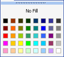
Keeping your custom colors in the closest possible palette location to their equivalent in the standard Excel palette ensures that when you apply your palette to a document with colors already used, that the colors stay relatively the same, but with the proper shades assigned.
2. Set up the document
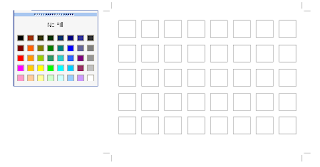
The way I went about designing my custom palette was to create a series of square blocks in Illustrator (you can also use PhotoShop or any good graphics tool with color capabilities, but you'll see in a minute why Illustrator is great for this), 8 blocks wide and 5 blocks high. This replicates the number and location of the swatches in Excel.
Set up the document - notice I've pasted a screen shot of the Excel color menu for a reference
3. Define the colors you know you'll need
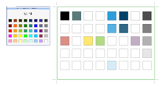
Then, I colored the blocks corresponding to their location on the palette with the colors I knew I wanted - black, white, grays, and my company's main logo color, picking the location on the grid that was closest to my custom color. This left me with about 75% of my blocks still uncolored. Then I used Illustrator's Color Guide palette and Live Color dialog to expand on these colors (which makes it super fast and easy to create complete palettes - hence the reason for using Illustrator!).
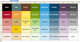
These were my starting colors - colors from our existing palette.
4.Fill in any missing color spots with a coordinating equivalent
The color guide can show lots of variations on the selected color, by tint/shade or vivid/muted, so most of the work of creating new shades of my primary colors was already done for me, it was just a matter of picking what looked good. I added lighter tints and darker shades of my starting colors. Then I picked a coordinating color from each hue in the spectrum (red, orange, yellow, green, blue and purple) to be my "base" colors. I put these colors in the second row from the top, which seemed to be the closest hue/value match for them.
For the blocks directly below those colors (lighter shades of those colors), I created a discreet series of tints, starting with 80%, then 60%, 40%, and 20%. This created a nice variation of tints that should work for many uses. After this there were a couple blocks left over, so I filled those with neutral browns and tans.
My complete Palette, in Illustrator

5. Bring your palette into Excel
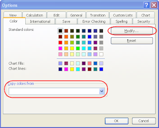
Now I had a complete color palette, which I needed to bring into Excel. This was the "there's no way around it" un-fun part. Open a blank spreadsheet, go to Tools > Options and pick the Color tab. Here you can select each color in the palette and hit the "Modify" button to change it. If you go to the custom tab in the Modify dialog, you can type in custom RGB values. Go back to Illustrator, and get the RGB value of each color block, and transfer it to Excel. Having the color palette open and displaying the RGB values for the selected color in Illustrator makes this easier. Manually go through every color in the Excel palette and change it to your custom color. Don't forget to save the document early on so it starts auto saving, because this takes awhile and God forbid you lose this work!
6. Use the palette
Once you've assigned all your colors, save the document in a place you'll remember. Then to use it, open up both your color palette spreadsheet and the document you want to colorize. Go to Tools > Options in your working document, and go to the Colors tab. You'll see at the bottom of this dialog there is a drop down of all open documents, with an option to "Copy colors from" (see figure above). Select your palette document, and hit OK, which copies the colors from it to your new document. Viola, your custom colors are now available in your new document! If there were colors already assigned in your new spreadsheet, they should have shifted to match your new palette.
I also colored the cells in the first sheet of my custom palette spreadsheet with one cell corresponding to each color in the palette, just so it was obvious what was in that document (since the color settings are not initially invisible) and so you can get a bigger preview of all the colors for future modifications. This is also helpful for when you share the sheet with others. You may also want to try printing your swatches just to be sure they still look good when printed.
Update: if you'd like a copy of this palette, you can download it from the link below, via Adobe SHARE!
https://share.adobe.com/adc/document.do?docid=d683d417-9cf0-11dc-8fe2-d702873d34e2
Did you know that you can actually customize every color available in the Excel palette, and then apply it to any spreadsheet? Here's how to design a custom Excel color palette so you can define your colors once and never have to worry about them again...and easily apply your color variations to existing spreadsheet.
1. Plan the palette
Take a look at the standard Excel color palette. It contains black, white, a range of grays and then several primary colors in varying tints. In other words, a selection of primary colors and tings and shades of those colors. When you design your own color palette, consider how your company color palette maps to these swatches. So if your company color is green, you probably want to replace all the greens in the Excel palette with tints (lighter) and shades (darker) of your company's green color. Most likely you also have other colors you frequently use, so in your custom palette you'll want to place these colors in the location that's closest to that color.

Keeping your custom colors in the closest possible palette location to their equivalent in the standard Excel palette ensures that when you apply your palette to a document with colors already used, that the colors stay relatively the same, but with the proper shades assigned.
2. Set up the document
The way I went about designing my custom palette was to create a series of square blocks in Illustrator (you can also use PhotoShop or any good graphics tool with color capabilities, but you'll see in a minute why Illustrator is great for this), 8 blocks wide and 5 blocks high. This replicates the number and location of the swatches in Excel.
Set up the document - notice I've pasted a screen shot of the Excel color menu for a reference

3. Define the colors you know you'll need
Then, I colored the blocks corresponding to their location on the palette with the colors I knew I wanted - black, white, grays, and my company's main logo color, picking the location on the grid that was closest to my custom color. This left me with about 75% of my blocks still uncolored. Then I used Illustrator's Color Guide palette and Live Color dialog to expand on these colors (which makes it super fast and easy to create complete palettes - hence the reason for using Illustrator!).
These were my starting colors - colors from our existing palette.

4.Fill in any missing color spots with a coordinating equivalent
The color guide can show lots of variations on the selected color, by tint/shade or vivid/muted, so most of the work of creating new shades of my primary colors was already done for me, it was just a matter of picking what looked good. I added lighter tints and darker shades of my starting colors. Then I picked a coordinating color from each hue in the spectrum (red, orange, yellow, green, blue and purple) to be my "base" colors. I put these colors in the second row from the top, which seemed to be the closest hue/value match for them.
For the blocks directly below those colors (lighter shades of those colors), I created a discreet series of tints, starting with 80%, then 60%, 40%, and 20%. This created a nice variation of tints that should work for many uses. After this there were a couple blocks left over, so I filled those with neutral browns and tans.
My complete Palette, in Illustrator

5. Bring your palette into Excel
Now I had a complete color palette, which I needed to bring into Excel. This was the "there's no way around it" un-fun part. Open a blank spreadsheet, go to Tools > Options and pick the Color tab. Here you can select each color in the palette and hit the "Modify" button to change it. If you go to the custom tab in the Modify dialog, you can type in custom RGB values. Go back to Illustrator, and get the RGB value of each color block, and transfer it to Excel. Having the color palette open and displaying the RGB values for the selected color in Illustrator makes this easier. Manually go through every color in the Excel palette and change it to your custom color. Don't forget to save the document early on so it starts auto saving, because this takes awhile and God forbid you lose this work!

6. Use the palette
Once you've assigned all your colors, save the document in a place you'll remember. Then to use it, open up both your color palette spreadsheet and the document you want to colorize. Go to Tools > Options in your working document, and go to the Colors tab. You'll see at the bottom of this dialog there is a drop down of all open documents, with an option to "Copy colors from" (see figure above). Select your palette document, and hit OK, which copies the colors from it to your new document. Viola, your custom colors are now available in your new document! If there were colors already assigned in your new spreadsheet, they should have shifted to match your new palette.
I also colored the cells in the first sheet of my custom palette spreadsheet with one cell corresponding to each color in the palette, just so it was obvious what was in that document (since the color settings are not initially invisible) and so you can get a bigger preview of all the colors for future modifications. This is also helpful for when you share the sheet with others. You may also want to try printing your swatches just to be sure they still look good when printed.

Update: if you'd like a copy of this palette, you can download it from the link below, via Adobe SHARE!
https://share.adobe.com/adc/document.do?docid=d683d417-9cf0-11dc-8fe2-d702873d34e2
Tuesday, July 3, 2007
Amateur Alert: "site designed by..."
One of my favorite "mean things to do on the web" is to click on those little links some web design firms put on their clients' sites that say "site designed by" or "powered by" (insert company name and link here)...then I visit the designer's site and point and laugh. Better than flaming someone, right?
Don't I sound horrible and cruel? But seriously, I don't know that I've ever seen this "stamp" on a well-designed, professional site. If your site looks like this, the last thing you want to do is draw attention to the fact that it's your work. Some may claim that their clients don't mind this, but I don't buy that. When I started at my first company, the first think they asked me to do to their website was to remove all references to the design company that created it. They did not realize that they had a choice in whether to put it there in the first place.
Putting your name on a client's site is rarely an acceptable practice. The one case where I really think it's ok to add a credit is if you have volunteered design services for say, an open source or community site. Then, you've probably donated the design and perhaps you deserve a link. But still, the more professional way to handle it is to mention your company as a news item or press release on the new site when it launches. For example, "we're pleased to announce the launch of our new site, designed by XYZ Web Design".
Or you could take it a little farther and spin it as a "partnership" project between your company and the client, with some nice quotes about how you worked together to develop an innovative site. If you constrain your "credit" to the launch of the site, it also limits your implied responsibility for the design of the site years down the road when it's horribly outdated and your work has drastically improved!
Just putting your name and link on your client's site (no matter how small or out of the way) because it's part of your contract and that's how you intend to spread your name is simply not professional. Your work should speak for itself. If your client is truly happy, they will spread your name on their own. People will compliment their site and the client will say "thanks, I had this great little company develop it..."
Instead, use your portfolio on your own website, and show off your client sites there with actual links to demonstrate that the site is still being used and it works, and that it's not student work or spec work. A quote from the client can also validate this. And nothing looks worse than when you show a pixel-perfect mock-up in your portfolio, but if you actually visit the site it's a mess. You can't fake good work.
Let your work speak louder than a link that some client was forced to put on their site.
Thursday, May 3, 2007
Adobe Stock Photos is teh kewl
I didn't really use Adobe stock photos before now, I pretty much used Getty and a couple alternates when I couldn't find what I need on Getty, and that was it. I somehow felt like I would not get as good a deal if I didn't go through the manufacturer.
However, over the past year or two, I've seen a lot of excellent new royalty-free stock photography houses blossoming. There's the trend towards all-you-can-download pricing (Shutterstock, LiquidLibrary), and the super-inexpensive, community-based sites (iStockPhoto). These have turned out to be a real boon for me when I needed simple, generic images. Need a picture of a plain old book? Or just a smiling dude? You'll find hundreds.
But when it comes to a large campaign with a 15000-piece print run, maybe you want something more unique. In those cases, I've moved away from the majors (Getty and Corbis) because they are not only expensive, but they are so popular there is a good chance that someone else will have used your image. Veer and Creatas are popular with a lot of designers, and they do tend to carry more unique images, but with a smaller selection.
After awhile, all this searching among several sites gets tedious. And some stock websites are considerably better than others - pricing at your fingertips, convenient comps and zoomed views, as well as how painful it is to page through 1100 images...the amenities vary widely from site to site. I find myself sometimes wishing one site had the xyz feature of another.
Enter Adobe Stock Photos. A convenient, robust, fast and slick interface that brings together the selection of dozens of stock houses, with fairly consistent and reasonable pricing. The only other thing I can ask for would be the ability to search for disks of images, or find the disk associated with an image if available (if I find one I really like, chances are there are others from the same photographer or shoot). And perhaps some additional "smart" search tools, but really when the interface works this well I don't mind looking through a few more images. I just bought my first three photos there, and I'm really pleased!
Friday, April 20, 2007
Drawing Maps with Illustrator
I did a fun little project this week that I’ve done a few times before, but this time I thought I’d write up a little tutorial on it to share. I’ve you’ve done any amount of graphic design, you’ve probably had to draw maps, maybe as directions to an event or office. Illustrator has some cool features that come in handy for this type of illustrated map. The map I’m doing here is pretty simple, but using these techniques, you can go as fancy and stylized as you want. Maybe when I have time I’ll update these images to show alternate styles.
Find your source map – a real map that you can trace. (cough*google*cough)
Scan it, or grab a screen shot and paste it into your Illustrator document as a template. Place it where you want it, and lock the layer.

Create a new layer for your roads. You may want to have a couple layers, one for major roads, one for minor roads, one for highways, etc. Trace the roads you want to show on this layer, using the line and pen tools. It helps to draw these paths in a color that contrasts with your map so you don’t give yourself a headache looking at all those lines.
Tip – to make it easier when you add the labels to these roads, pay mind to the direction you draw them in. Start to the left and work your way towards right. This will make your path go in the direction your text should go. Draw your strokes down the center of where the road should be. Pay attention to street names you’re tracing and try to use one path per street, this will make it easier to label them later. If you draw multiple streets with a single path, you’ll have to break them up later.

If you’re tracing several roads, you may want to style them differently. Once you have your major roads traced, lock the layer, and create another for minor roads. You will probably want this one under your major roads layer. Keep each set of roads on its own layer for easy access.

You can style the roads a couple ways. Brushes work well for complex styles. To define a custom brush, draw the shape you want to represent your road, select it, and then hit the “new brush” button in the brushes palette, or drag it into the brushes Palette. Choose “Art Brush” as the type of brush. This will tell Illustrator to stretch the shape you’ve drawn over the length of the path. You can also adjust the scale of it later if you decide you want your roads wider. Because we’ve separated our major and minor roads onto different layers, you can define separate brushes for each.

An alternate way to style the roads is to customize the stroke for the road – make it wider and apply a color. You don’t have as much flexibility or styling options as you do with creating a brush, but this makes it easier to flatten the roads later. After you're done, you’ll want to expand the appearance of the brushes, or strokes. Another reason we made a backup of those layers!
Make the stroke wide as you wish the road to be:

Color it to match the road:

Expand the path:

Add desired borders:

Duplicate your first road layer to keep a backup (you’ll need it later - lock it and turn its visibility off to get it out of the way), then apply the brush you created for major roads to those paths, or style those paths with your desired strokes. Do the same for all other road layers – keeping a copy of the original paths for each. You can turn the visibility of your traced template layer on and off to see how it looks.
Once you’re done, you may notice that the intersections of the roads may look a little funky from your brushes or strokes, and that any borders around the road lines cross over eachother rather than intersecting.

To fix this, we'll use the Pathfinder to add the shapes together for the desired effect. This is much simpler with strokes than it is with brushes, another reason to use a stroke if you can. With strokes, you can select all of the expanded strokes, hit the “add” button, and you’re done. With brushes you’ll have to carefully expand the appearance of each, and add them together one at a time.

Much better!

Now we’re going to add labels. Create another copy of your backed up road path layers, this one will be where we add the text labels. Using the text tool, add street names to each road path. You can use the baseline adjustment on the Character palette to align the text it where you’d like it to appear in relation to the road path. Drag the slider handles around the text with the arrow tool to position the text where you want it, or flip it to the opposite side of the path.
Insert text along the path:
Adjust the text style and baseline:

Drag the text to the desired location:

As you can see from these screen shots, I'm turning the visibility of the template on for reference and off for clarity.
Once all of your roads are labeled, you can draw in icons, placemarks, pushpins and landmarks. These all go on separate layers for convenience. If you want to use lots of cute little landmark or interstate icons, create symbols from your icons for easy duplication and editing.
Here’s my finished map…directions to my office! Now I know this article was cool, please try to refrain from stalking me.

Tuesday, April 10, 2007
Launch of MSL.com, my latest project
I'm pleased to announce the launch of my company's new website:
http://www.msl.com
It's been in the works for awhile, but since I'm the lone wolf doing all the content, design and development, it's taken awhile. Needless to say I'm happy it's done and quite pleased with the results. Of course, it's never really done! I had to hold back on many of the features I wanted to build, because we really just needed to move away from our old, static HTML tag-soup site. However like all sites, it's a work in progress and will continue to change over the coming months.
For the geeks, it's built with ColdFusion 7 and utilizing the Model-Glue framework. It also uses YUI for the menus and some of the layout, and SPRY for some of the other AJAX/DHTML stuff. The markup is XHTML/CSS, it did validate at one point but the YUI menus don't validate...bummer. Oh well! I've never been that sort of standardista...
Tuesday, February 20, 2007
Design is a living process
I'm a big fan of Campaign Monitor, both as a site and as a tool. One of the things I really admire about their design is how they have designed every detail. If you dissect the design, it's simple, and straightforward, and not unusual. There's no "one thing" about the design that makes it exceptional. What makes it exceptional is the fact that every single character and pixel has been thought out and carefully designed. It's a great work of usability.
They didn't just design a "frame" for the site, they designed the content as well. This is what I believe truly separates the "ok" designs from the great ones.
Some examples of how they have designed the details:
The method I use to inject quality design at every level of a site, is to design (with whatever tool you prefer) several pages in addition to the home page and sub page. This requires a great deal of preparation. You have to know what content you are going to have, and where it will go. You have to think the content over thoroughly during the design phase. Often it's hard to visualize content without actually having a site design, so I find it's something of a back-and-forth process. Work on the main site design, develop a look; then go design the content pages, go back and adjust your layout...
Design is a living process, it can never all be done "up front", and there is no such thing as taking a template and running with it forever and ever. I'm not trying to create job security for myself, but I do know that well designed sites like CampaignMonitor don't happen by accident.
They didn't just design a "frame" for the site, they designed the content as well. This is what I believe truly separates the "ok" designs from the great ones.
Some examples of how they have designed the details:
- the headings of their tables (data grids) have a subtle, attractive gradient background and a subtle banded scheme with a nice hover/highlight effect
- every screen shot (features, resources pages) is attractive and neatly cropped
- the "price tag" on their pricing page is impossible to miss, yet matches the site perfectly
- the icons are used consistently throughout the site
The method I use to inject quality design at every level of a site, is to design (with whatever tool you prefer) several pages in addition to the home page and sub page. This requires a great deal of preparation. You have to know what content you are going to have, and where it will go. You have to think the content over thoroughly during the design phase. Often it's hard to visualize content without actually having a site design, so I find it's something of a back-and-forth process. Work on the main site design, develop a look; then go design the content pages, go back and adjust your layout...
Design is a living process, it can never all be done "up front", and there is no such thing as taking a template and running with it forever and ever. I'm not trying to create job security for myself, but I do know that well designed sites like CampaignMonitor don't happen by accident.
Friday, February 16, 2007
Using Clip Art, Sin-Free
Clip art is typically thought of by many, particularly in the Design community, as something to be avoided like the plague. “Designers who use clip art are not designers.”
While I have seen many really ugly designs that use clip art, I think the problem still comes back to poor design, not bad clip art. In fact, a lot of the clip art illustrations out there are quite good. Yes, there’s bad clip art, and it should be avoided, but there is also clip art that can be carefully used to your advantage with effective results.
Often clip art is a good solution when you have little or no budget for proper imagery, but there are ways to prevent it from looking cheap. Especially if you’re willing to put a little elbow grease into it.
Here are some tips to keep your design looking good when you are forced to use clip art.
Size and Proportion Still Matters
This is probably the biggest flaw I see with most clip art use. Because it’s being designed by someone with little design knowledge (knowing MS Publisher does not count as design knowledge!), basic rules of size, proportion and alignment are broken.
The most common thing I would change? Make it bigger! But, you ask, why would you want to make ugly clip art bigger? Because most of the time the design has used insufficient white space, and there is generally not enough room on the page, so the clip art gets reduced to minute icon-like sizes to enable everything else to fit. Then there are a few different clips, all too small, sprinkled throughout the page.
Better to pick one or two of the best clips and make them bigger, which will add some visual tension to the design. The clip then becomes an anchor or focal point of the design, rather than another extra element on the page. (While you’re at it, shorten the copy and add some negative space!)
Control the Color
Usually the user of the clip art takes it as it is and uses it. But sometimes the color palette in the clip is simply atrocious. Sometimes the color is close but not a perfect match for other color on the page. Sometimes the clip just doesn’t match at all. Red flag!
It requires some extra work, but if you edit the clip (usually in Illustrator) so that the color scheme is better, or so that the reds in the clip match the rest of the red on the page, or so the clip coordinates better with the style of the design, it will look nicely integrated into your design rather than popping out and saying “my designer is a loser.”
Get thee a color wheel (or visit Kuler), and come up with a new scheme for the clip. Learn to use the Illustrator commands like Select > Same > Fill Color/Stroke to replace colors in a few easy steps.
Don’t Mix Themes
Clip art often comes in convenient stylistic collections or themes. You’ll see series’ of clips revolving around say, Sports or Plants or Food that share similar design characteristics, color scheme and look. They’re great used together. They look terrible when they’re mixed. If you’re really good, you can modify one to match the style of another theme, but in general, avoid using clips from different themes together. And make sure that the theme matches the overall look of your document.
Don’t Use Clichés
Design clichés are bad no matter the form, whether it’s stock photography or clip art or typography. Run from Screen Beans. In general, make sure what you are showing with Clip art is a well thought out use of the image. Beware, clip art collections are chock full of clichés, because most people who use clip art want exactly that (although they may not realize it). Try to think of an out-of-the-box use for the image, and don’t use the just-plain-terrible clichés, like Screen Beans.
Use it as a Starting Point
Perhaps you’re not a skilled enough illustrator to draw a printer from scratch (I'm not...), but you can surely find a bazillion clips of printers. Pick a few that are close to what you like, and trace them, cut up, stretch, and recombine them, or just use them as a reference to create your own, original illustration. Remember, you don’t have to use clip art as-is!
Trace a Photo or Drawing
If you need a clip-art like image but can’t find one that isn’t fugly, try tracing a photo. Illustrator’s Live Trace feature can produce some really nice results in just a few minutes. Trace the photo, tweak the color to your liking, remove backgrounds and stray points, maybe add some brushes to the strokes; and you’ve got your own, original clip art.
Easy Icons
You have to design a set of icons for something completely random, and you can’t find (or afford) what you need from IconBuffet. You can use clip art as a starting point to help you design your own. It will usually require some simplification, but at least you won’t be starting from scratch. Take similar, simple illustrations which provide an outline structure. Then use that base, and simplify, shrink, restyle, and rework until you have your desired icon. A lot of what makes an icon set work well is consistency in style and treatment - color, stroke, fill, shape - apply the same features consistently to several clips and you've got icons.
And lastly...
Here are some Clip Art sources that you probably already have available to you:
Happy clipping!
While I have seen many really ugly designs that use clip art, I think the problem still comes back to poor design, not bad clip art. In fact, a lot of the clip art illustrations out there are quite good. Yes, there’s bad clip art, and it should be avoided, but there is also clip art that can be carefully used to your advantage with effective results.
Often clip art is a good solution when you have little or no budget for proper imagery, but there are ways to prevent it from looking cheap. Especially if you’re willing to put a little elbow grease into it.
Here are some tips to keep your design looking good when you are forced to use clip art.
Size and Proportion Still Matters
This is probably the biggest flaw I see with most clip art use. Because it’s being designed by someone with little design knowledge (knowing MS Publisher does not count as design knowledge!), basic rules of size, proportion and alignment are broken.
The most common thing I would change? Make it bigger! But, you ask, why would you want to make ugly clip art bigger? Because most of the time the design has used insufficient white space, and there is generally not enough room on the page, so the clip art gets reduced to minute icon-like sizes to enable everything else to fit. Then there are a few different clips, all too small, sprinkled throughout the page.
Better to pick one or two of the best clips and make them bigger, which will add some visual tension to the design. The clip then becomes an anchor or focal point of the design, rather than another extra element on the page. (While you’re at it, shorten the copy and add some negative space!)
Control the Color
Usually the user of the clip art takes it as it is and uses it. But sometimes the color palette in the clip is simply atrocious. Sometimes the color is close but not a perfect match for other color on the page. Sometimes the clip just doesn’t match at all. Red flag!
It requires some extra work, but if you edit the clip (usually in Illustrator) so that the color scheme is better, or so that the reds in the clip match the rest of the red on the page, or so the clip coordinates better with the style of the design, it will look nicely integrated into your design rather than popping out and saying “my designer is a loser.”
Get thee a color wheel (or visit Kuler), and come up with a new scheme for the clip. Learn to use the Illustrator commands like Select > Same > Fill Color/Stroke to replace colors in a few easy steps.
Don’t Mix Themes
Clip art often comes in convenient stylistic collections or themes. You’ll see series’ of clips revolving around say, Sports or Plants or Food that share similar design characteristics, color scheme and look. They’re great used together. They look terrible when they’re mixed. If you’re really good, you can modify one to match the style of another theme, but in general, avoid using clips from different themes together. And make sure that the theme matches the overall look of your document.
Don’t Use Clichés
Design clichés are bad no matter the form, whether it’s stock photography or clip art or typography. Run from Screen Beans. In general, make sure what you are showing with Clip art is a well thought out use of the image. Beware, clip art collections are chock full of clichés, because most people who use clip art want exactly that (although they may not realize it). Try to think of an out-of-the-box use for the image, and don’t use the just-plain-terrible clichés, like Screen Beans.
Use it as a Starting Point
Perhaps you’re not a skilled enough illustrator to draw a printer from scratch (I'm not...), but you can surely find a bazillion clips of printers. Pick a few that are close to what you like, and trace them, cut up, stretch, and recombine them, or just use them as a reference to create your own, original illustration. Remember, you don’t have to use clip art as-is!
Trace a Photo or Drawing
If you need a clip-art like image but can’t find one that isn’t fugly, try tracing a photo. Illustrator’s Live Trace feature can produce some really nice results in just a few minutes. Trace the photo, tweak the color to your liking, remove backgrounds and stray points, maybe add some brushes to the strokes; and you’ve got your own, original clip art.
Easy Icons
You have to design a set of icons for something completely random, and you can’t find (or afford) what you need from IconBuffet. You can use clip art as a starting point to help you design your own. It will usually require some simplification, but at least you won’t be starting from scratch. Take similar, simple illustrations which provide an outline structure. Then use that base, and simplify, shrink, restyle, and rework until you have your desired icon. A lot of what makes an icon set work well is consistency in style and treatment - color, stroke, fill, shape - apply the same features consistently to several clips and you've got icons.
And lastly...
Here are some Clip Art sources that you probably already have available to you:
- Microsoft Office Clip art and Clip art Online
- Illustrator’s packaged clip art (look on your hard drive for Adobe\Resources and Extras\Goodies\Illustrator CS2\Clip Art and Stock Photos)
- Illustrator’s packaged symbols and brushes (Window > {various} Libraries)
Happy clipping!
Wednesday, February 7, 2007
Design Patterns for Designers
A few years ago I got this book on design patterns for web design - graphics, html and visuals. It was a really interesting book, it collected a few years worth of web design best practices in a single place, covering everything from navigation (tabs, breadcrumbs, drill-down, etc) to shopping carts. It talked about the popular-thus-familiar ways the best patterns worked, and some pitfalls to avoid when using them. It also showed a lot of screen shots of the design in action. I hadn't seen any other book like it, so I ate it up. I highly recommend it, I believe there is a newer edition out now.
Today I discovered that the always interesting Yahoo Developer Network has a Design Patterns section, and it seems to have a lot of cutting edge patterns. I'm very pleased to see design patterns for web design becoming more mainstream - it's kind of a sign of the industry maturing.
Today I discovered that the always interesting Yahoo Developer Network has a Design Patterns section, and it seems to have a lot of cutting edge patterns. I'm very pleased to see design patterns for web design becoming more mainstream - it's kind of a sign of the industry maturing.
Subscribe to:
Comments (Atom)
