The Adobe AIR team has made their O'Reilly book, Adobe AIR for JavaScript Developers available for free under Creative Commons License:
Download the Free AIR Book
I understand you can also get a free print version by visiting one of the AIR bus tour events. Thanks, AIR team!
Tuesday, July 10, 2007
Friday, July 6, 2007
Create a custom Excel color palette
Microsoft Excel was never meant to be a graphic layout tool, but that doesn't eliminate the need for Excel documents to look nice. I work for a financial firm, so naturally we do a LOT with Excel, and I'm always being sent Excel files to "make pretty", or given spreadsheets for reports and presentations that must look nice. After getting really tired of manually tweaking Excel colors to match company colors and de-uglify spreadsheets, I finally put together a complete custom palette that incorporates our company colors, logo colors, and coordinating colors of various hues.
Did you know that you can actually customize every color available in the Excel palette, and then apply it to any spreadsheet? Here's how to design a custom Excel color palette so you can define your colors once and never have to worry about them again...and easily apply your color variations to existing spreadsheet.
1. Plan the palette
Take a look at the standard Excel color palette. It contains black, white, a range of grays and then several primary colors in varying tints. In other words, a selection of primary colors and tings and shades of those colors. When you design your own color palette, consider how your company color palette maps to these swatches. So if your company color is green, you probably want to replace all the greens in the Excel palette with tints (lighter) and shades (darker) of your company's green color. Most likely you also have other colors you frequently use, so in your custom palette you'll want to place these colors in the location that's closest to that color.
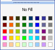
Keeping your custom colors in the closest possible palette location to their equivalent in the standard Excel palette ensures that when you apply your palette to a document with colors already used, that the colors stay relatively the same, but with the proper shades assigned.
2. Set up the document
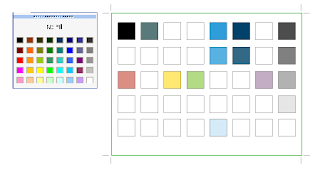
The way I went about designing my custom palette was to create a series of square blocks in Illustrator (you can also use PhotoShop or any good graphics tool with color capabilities, but you'll see in a minute why Illustrator is great for this), 8 blocks wide and 5 blocks high. This replicates the number and location of the swatches in Excel.
Set up the document - notice I've pasted a screen shot of the Excel color menu for a reference

3. Define the colors you know you'll need
Then, I colored the blocks corresponding to their location on the palette with the colors I knew I wanted - black, white, grays, and my company's main logo color, picking the location on the grid that was closest to my custom color. This left me with about 75% of my blocks still uncolored. Then I used Illustrator's Color Guide palette and Live Color dialog to expand on these colors (which makes it super fast and easy to create complete palettes - hence the reason for using Illustrator!).
These were my starting colors - colors from our existing palette.
4.Fill in any missing color spots with a coordinating equivalent
The color guide can show lots of variations on the selected color, by tint/shade or vivid/muted, so most of the work of creating new shades of my primary colors was already done for me, it was just a matter of picking what looked good. I added lighter tints and darker shades of my starting colors. Then I picked a coordinating color from each hue in the spectrum (red, orange, yellow, green, blue and purple) to be my "base" colors. I put these colors in the second row from the top, which seemed to be the closest hue/value match for them.
For the blocks directly below those colors (lighter shades of those colors), I created a discreet series of tints, starting with 80%, then 60%, 40%, and 20%. This created a nice variation of tints that should work for many uses. After this there were a couple blocks left over, so I filled those with neutral browns and tans.
My complete Palette, in Illustrator

5. Bring your palette into Excel
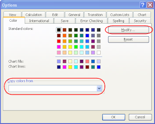
Now I had a complete color palette, which I needed to bring into Excel. This was the "there's no way around it" un-fun part. Open a blank spreadsheet, go to Tools > Options and pick the Color tab. Here you can select each color in the palette and hit the "Modify" button to change it. If you go to the custom tab in the Modify dialog, you can type in custom RGB values. Go back to Illustrator, and get the RGB value of each color block, and transfer it to Excel. Having the color palette open and displaying the RGB values for the selected color in Illustrator makes this easier. Manually go through every color in the Excel palette and change it to your custom color. Don't forget to save the document early on so it starts auto saving, because this takes awhile and God forbid you lose this work!
6. Use the palette
Once you've assigned all your colors, save the document in a place you'll remember. Then to use it, open up both your color palette spreadsheet and the document you want to colorize. Go to Tools > Options in your working document, and go to the Colors tab. You'll see at the bottom of this dialog there is a drop down of all open documents, with an option to "Copy colors from" (see figure above). Select your palette document, and hit OK, which copies the colors from it to your new document. Viola, your custom colors are now available in your new document! If there were colors already assigned in your new spreadsheet, they should have shifted to match your new palette.
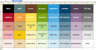
I also colored the cells in the first sheet of my custom palette spreadsheet with one cell corresponding to each color in the palette, just so it was obvious what was in that document (since the color settings are not initially invisible) and so you can get a bigger preview of all the colors for future modifications. This is also helpful for when you share the sheet with others. You may also want to try printing your swatches just to be sure they still look good when printed.
Update: if you'd like a copy of this palette, you can download it from the link below, via Adobe SHARE!
https://share.adobe.com/adc/document.do?docid=d683d417-9cf0-11dc-8fe2-d702873d34e2
Did you know that you can actually customize every color available in the Excel palette, and then apply it to any spreadsheet? Here's how to design a custom Excel color palette so you can define your colors once and never have to worry about them again...and easily apply your color variations to existing spreadsheet.
1. Plan the palette
Take a look at the standard Excel color palette. It contains black, white, a range of grays and then several primary colors in varying tints. In other words, a selection of primary colors and tings and shades of those colors. When you design your own color palette, consider how your company color palette maps to these swatches. So if your company color is green, you probably want to replace all the greens in the Excel palette with tints (lighter) and shades (darker) of your company's green color. Most likely you also have other colors you frequently use, so in your custom palette you'll want to place these colors in the location that's closest to that color.

Keeping your custom colors in the closest possible palette location to their equivalent in the standard Excel palette ensures that when you apply your palette to a document with colors already used, that the colors stay relatively the same, but with the proper shades assigned.
2. Set up the document
The way I went about designing my custom palette was to create a series of square blocks in Illustrator (you can also use PhotoShop or any good graphics tool with color capabilities, but you'll see in a minute why Illustrator is great for this), 8 blocks wide and 5 blocks high. This replicates the number and location of the swatches in Excel.
Set up the document - notice I've pasted a screen shot of the Excel color menu for a reference

3. Define the colors you know you'll need
Then, I colored the blocks corresponding to their location on the palette with the colors I knew I wanted - black, white, grays, and my company's main logo color, picking the location on the grid that was closest to my custom color. This left me with about 75% of my blocks still uncolored. Then I used Illustrator's Color Guide palette and Live Color dialog to expand on these colors (which makes it super fast and easy to create complete palettes - hence the reason for using Illustrator!).
These were my starting colors - colors from our existing palette.

4.Fill in any missing color spots with a coordinating equivalent
The color guide can show lots of variations on the selected color, by tint/shade or vivid/muted, so most of the work of creating new shades of my primary colors was already done for me, it was just a matter of picking what looked good. I added lighter tints and darker shades of my starting colors. Then I picked a coordinating color from each hue in the spectrum (red, orange, yellow, green, blue and purple) to be my "base" colors. I put these colors in the second row from the top, which seemed to be the closest hue/value match for them.
For the blocks directly below those colors (lighter shades of those colors), I created a discreet series of tints, starting with 80%, then 60%, 40%, and 20%. This created a nice variation of tints that should work for many uses. After this there were a couple blocks left over, so I filled those with neutral browns and tans.
My complete Palette, in Illustrator

5. Bring your palette into Excel
Now I had a complete color palette, which I needed to bring into Excel. This was the "there's no way around it" un-fun part. Open a blank spreadsheet, go to Tools > Options and pick the Color tab. Here you can select each color in the palette and hit the "Modify" button to change it. If you go to the custom tab in the Modify dialog, you can type in custom RGB values. Go back to Illustrator, and get the RGB value of each color block, and transfer it to Excel. Having the color palette open and displaying the RGB values for the selected color in Illustrator makes this easier. Manually go through every color in the Excel palette and change it to your custom color. Don't forget to save the document early on so it starts auto saving, because this takes awhile and God forbid you lose this work!

6. Use the palette
Once you've assigned all your colors, save the document in a place you'll remember. Then to use it, open up both your color palette spreadsheet and the document you want to colorize. Go to Tools > Options in your working document, and go to the Colors tab. You'll see at the bottom of this dialog there is a drop down of all open documents, with an option to "Copy colors from" (see figure above). Select your palette document, and hit OK, which copies the colors from it to your new document. Viola, your custom colors are now available in your new document! If there were colors already assigned in your new spreadsheet, they should have shifted to match your new palette.
I also colored the cells in the first sheet of my custom palette spreadsheet with one cell corresponding to each color in the palette, just so it was obvious what was in that document (since the color settings are not initially invisible) and so you can get a bigger preview of all the colors for future modifications. This is also helpful for when you share the sheet with others. You may also want to try printing your swatches just to be sure they still look good when printed.

Update: if you'd like a copy of this palette, you can download it from the link below, via Adobe SHARE!
https://share.adobe.com/adc/document.do?docid=d683d417-9cf0-11dc-8fe2-d702873d34e2
Tuesday, July 3, 2007
Amateur Alert: "site designed by..."
One of my favorite "mean things to do on the web" is to click on those little links some web design firms put on their clients' sites that say "site designed by" or "powered by" (insert company name and link here)...then I visit the designer's site and point and laugh. Better than flaming someone, right?
Don't I sound horrible and cruel? But seriously, I don't know that I've ever seen this "stamp" on a well-designed, professional site. If your site looks like this, the last thing you want to do is draw attention to the fact that it's your work. Some may claim that their clients don't mind this, but I don't buy that. When I started at my first company, the first think they asked me to do to their website was to remove all references to the design company that created it. They did not realize that they had a choice in whether to put it there in the first place.
Putting your name on a client's site is rarely an acceptable practice. The one case where I really think it's ok to add a credit is if you have volunteered design services for say, an open source or community site. Then, you've probably donated the design and perhaps you deserve a link. But still, the more professional way to handle it is to mention your company as a news item or press release on the new site when it launches. For example, "we're pleased to announce the launch of our new site, designed by XYZ Web Design".
Or you could take it a little farther and spin it as a "partnership" project between your company and the client, with some nice quotes about how you worked together to develop an innovative site. If you constrain your "credit" to the launch of the site, it also limits your implied responsibility for the design of the site years down the road when it's horribly outdated and your work has drastically improved!
Just putting your name and link on your client's site (no matter how small or out of the way) because it's part of your contract and that's how you intend to spread your name is simply not professional. Your work should speak for itself. If your client is truly happy, they will spread your name on their own. People will compliment their site and the client will say "thanks, I had this great little company develop it..."
Instead, use your portfolio on your own website, and show off your client sites there with actual links to demonstrate that the site is still being used and it works, and that it's not student work or spec work. A quote from the client can also validate this. And nothing looks worse than when you show a pixel-perfect mock-up in your portfolio, but if you actually visit the site it's a mess. You can't fake good work.
Let your work speak louder than a link that some client was forced to put on their site.
Subscribe to:
Posts (Atom)
